11 Tips for a Usable Web Design

While content may be king in a successful website, usability has to be queen. You may have the best content out there with a gorgeous design and a page ranking to envy, but if your visitors can’t navigate your site they’re going to get fed up and leave. After all, getting visitors to click on your site is one thing; getting them to stay is another.
Professional usability analyses can cost in the ball park of $1500, but unless you’re a software mogul building a complicated professional web tool, there is no reason you need to shell out your hard earned cash to have someone tell you if your website works. After spending a year in a rigorous human-computer interaction program, the biggest fact I came away with is this: a user-friendly interface is about 90% common sense.
Described here are eleven rules for making your website user friendly. The first ten are Jakob Nielsen’s Ten Usability Heuristics. The last one is a mantra that should be burned into the mind of anyone involved in the design or building of a web site or software interface: you are not the user.

About Nilesen’s Heuristics
- Visibility of system status
- Match between system and the real world
- User control and freedom
- Consistency and standards
- Error prevention
- Recognition rather than recall
- Flexibility and efficiency of use
- Aesthetic and minimalist design
- Help users recognize, diagnose, and recover from errors
- Help and documentation
These ten heuristics are used by usability professionals to perform what is called a heuristic evaluation. The main goal of a heuristic evaluation is to identify any problems associated with the design of user interfaces, and to suggest possible solutions. An evaluation is best performed by someone who has not been involved in the design of the interface (see rule #11, you are not the user), but keeping these in mind during the design process can help you solve the majority of usability issues before they happen.
A heuristic evaluation is an informal analysis, and depending on the complexity of your interface a more in-depth evaluation may be needed. But if you’re looking at this site instead of a professional usability analyst, chances are these heuristics will catch all of your biggest usability problems and most of the minor annoyances.

1. Visibility of system status
“The system should always keep users informed about what is going on, through appropriate feedback within reasonable time.”
Flash movies, image galleries and the like have loading bars for a reason. If something needs time to download or upload, show the user an icon, if not a progress bar, so they know something is happening even if the screen is blank. Blank screens scare visitors away.
Similarly, when a download or upload is complete, tell the user that too. If a user upload a photo to their profile, or makes a new forum post and hits save, tell them that the save was successful (and if not, tell them why--see heuristic #9, Error recognition and recovery). If the user’s not sure their change was successful, they may try doing it again which only gets frustrating, especially when they’ve discovered they made multiple copies of a post or uploaded duplicate photos.
Visibility of system status is important in non-dynamic content as well. If you have a multi-page article or form, show the user what stage they’re at or what page they’re on, so they know how much further they have to go, or where to go if they want to come back later. Account creation or online checkout are good examples of these multi-page forms, and it is a simple matter to add a few tabs or breadcrumbs across the top to show the user where they are in the process.

2. Match between system and the real world
“The system should speak the user's language, with words, phrases and concepts familiar to the user, rather than system-oriented terms. Follow real-world conventions, making information appear in a natural and logical order.”
I really think Mac’s trash can icon set the standard for this one. What is more intuitive or more representative of the real world than dragging a piece of paper to a trash can? Even better, the trash can icon changes from empty to full if there is something in it that you can still pull out (which is also another example of heuristic #1, Visibility of system status).
Icons are the obvious poster-child for this heuristic, but it is also exemplified with such elements as WISYWIG editors (“what you see is what you get”) and page tabs that emulate file folder tabs. The real world has permeated web language too, with terms like shopping cart, gallery, or journal.
The tricky part here is figuring out what “real world” you’re matching. Icons are great as long as they’re not too obscure, and even if an icon or label seems obvious to you, that doesn’t mean your users will under stand it (see rule #11, you are not the user). Unless you are using tried and true icons (such as the trash can) or have the time to test and retest various icon versions, your safest bet is to go with text labels, or a text/icon combination. And even then, I’m sure there is someone out there who will still ask what the “delete” button does.

3. User control and freedom
“Users often choose system functions by mistake and will need a clearly marked ‘emergency exit’ to leave the unwanted state without having to go through an extended dialogue. Support undo and redo.”
People make mistakes. No matter how easy your site is to use, or how much instruction you provide, someone is going to click on something they didn’t mean to. There is no escaping it, so the best thing you can do is help them fix it quickly and easily. This heuristic also goes hand in hand with #5 and #9 which have to do with error prevention and recovery.
If a user is in the middle of a multi-stage form, such as account creation or online check out, let them go back to previous steps if they realize they’ve made a mistake, and let them be able to cancel the process altogether right up until that final “Submit” button Similarly, if the user has navigated deep within your menu system, provide breadcrumb links so they know where they are and can find their way out.
Undo and redo are great as well. They clearly aren’t practical for everything, but in things like WISYWIG editors or other customizers where users are making a lot of little changes they can be very helpful. Google’s Gmail uses them brilliantly--I can’t tell you how often Gmail’s undo function has saved me from accidentally deleting a message or marking it as spam.

4. Consistency and standards
“Users should not have to wonder whether different words, situations, or actions mean the same thing. Follow platform conventions.”
Pick a style, pick a layout, and stick to it. If all your links are different styles and colors, it’s going to make it difficult for your users to figure out what they can click on. If your login or sign up button is in a different place on each page, your users will have a hard time finding it.
Platform conventions are important too--your users will be looking for certain things based on their experience throughout the web. For example, the little hand cursor that appears when you hover a link is a platform convention for the web. I’m not sure why one would want to remove it, but if you do, your users will have no idea that the link is a link. Similarly, if you give the hand cursor to something that is not a link, your users will think they can click on something that doesn’t do anything. Other conventions are more subtle, such as linking the site’s banner/logo back to the home page, or having the login/sign up field in the upper right corner.


5. Error prevention
“Even better than good error messages is a careful design which prevents a problem from occurring in the first place. Either eliminate error-prone conditions or check for them and present users with a confirmation option before they commit to the action.”
If the user is about to perform a decisive action that cannot be undone, make sure they know what they’re doing. For example, if the user is about to delete their profile, ask them if they’re sure and remind them that this cannot be undone. In World of Warcraft, if a user wants to delete a particularly rare item from their inventory, they have to actually type the word “delete” into the prompt instead of just pressing “ok”.
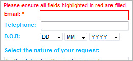
In a less extreme example, if a user is filling out a form, tell them what fields are required to prevent them from submitting an incomplete form. Or if they’re uploading a file, tell them the maximum file size and required format.

6. Recognition rather than recall
“Minimize the user's memory load by making objects, actions, and options visible. The user should not have to remember information from one part of the dialogue to another. Instructions for use of the system should be visible or easily retrievable whenever appropriate.”
Most people who are learning a foreign language will tell you it’s easier to read the language than speak it. Similarly, multiple choice questions on a test are usually easier to answer than open-ended questions. The reason for this is purely psychological: it is easier to compare your memories to given information (when all you really need is to trigger is a sense of familiarity) than it is to search your memory for the right answer.
That being said, don’t hide important information that the user will need to remember later. This goes for everything from step by step instructions to important menu items (though don’t overdo it--see #8, Aesthetics and minimalist design). This is somewhat related to my concern over icons in heuristic #2 (Match between system and the real word) as well. It is easier to recognize a text label than it is to recall what some obscure icon is supposed to represent.

7. Flexibility and efficiency of use
“Accelerators -- unseen by the novice user -- may often speed up the interaction for the expert user such that the system can cater to both inexperienced and experienced users. Allow users to tailor frequent actions.”
This probably won’t apply to most standard websites, but for say, forums or web applications, let returning users skip over the “Welcome! This is how you use our site!” page. Even better, remember who is returning and hide it unless they click the “how to use our site” link.
What can apply to most standard websites, however, is the idea of streamlining processes. There is no reason to have your users go through three different menus to find the “upload image” button when you can just put one right on their gallery page. For a long list of FAQs, list all the questions at the top of the page and link them to anchors at each of the answers to reduce excessive scrolling. Even better, provide a “return to top” button below each answer so the user can quickly jump back to the question list. If a user submits a form with an error, remember what they entered instead of resetting the form so the user can just fix the issue and move on instead of having to fill everything out again.
The ability to customize layouts of account pages like iGoogle and myYahoo, the bookmark toolbar in browsers, and the ability to group actions or units in games like World of Warcraft or Starcraft are also examples of this heuristic in action, namely “allowing users to tailor frequent actions.” It all comes down to streamlining processes--the quicker a user can perform their desired task, the happier they will be.

8. Aesthetic and minimalist design
“Dialogues should not contain information which is irrelevant or rarely needed. Every extra unit of information in a dialogue competes with the relevant units of information and diminishes their relative visibility.”
This often seems to be the hardest for people, particularly when paired with heuristic #6, Recognition vs Recall (see I’m helping you recognize what #6 is instead of making you recall it!). Number 6 can be interpreted as says “don’t hide anything”, but this runs the danger of making your site horribly, horribly cluttered where users instead can’t find anything. Long lists of links and huge walls of text can scare off visitors.
What #6 really says, though, is “don’t hide anything important”. That’s the trick--figuring out what is important enough to show up front, and what is ok to let your visitors recall. A good heuristic of thumb is to limit your navigation menu to no more than five or six links. Group any more than that into drop-downs under your five main links, but again, within reason. If you still have links that don’t group well with your main menu items, add a side bar, and again consider grouping similar links into sub-menus. The main content on the page should stick to one central issue. If there are related issues, add links to separate pages instead of fitting it all on one page--this can help reduce the “wall of text” look that visitors often find so frightening.
The other part of this heuristic is violated by almost every teen mySpace page or geosite--I’m sure we’ve all seen those sites that bombard us with dozens of rotating gifs and horrendous color choices that make our eyes bleed. Aesthetic doesn’t mean your site needs to be pretty. Craigslist won’t win any beauty contest, but it is clean, usable, and above all legible. If you’re serious about your design, learning a bit about color theory and text layout won’t hurt, but you really don’t need a degree in design to make a good site. Just remember that legible text and a clutter-free layout makes users happy.

9. Help users recognize, diagnose, and recover from errors
“Error messages should be expressed in plain language (no codes), precisely indicate the problem, and constructively suggest a solution.”
Even with your best efforts to apply heuristic #5 (Error Prevention) errors do happen, and when they do, be sure to tell the user what went wrong and how they can fix it. For example, if a user is trying to upload a 70 Mb image for their profile picture, don’t just say “Upload failed” or even “File size too large”, tell them “Upload failed. Maximum file size is 500 kb.” Similarly, if a user submits an incomplete form, don’t just tell them they missed a field, tell them which field, and even better, highlight it--particularly if it’s a long form.
Another example that I run into quite frequently are form fields that have a maximum character length. Specifically, fields where I paste in a paragraph of, say, a website description. Most of the time the form is kind enough to at least tell me what the maximum length is, and sometimes will even tell me I’m over the limit before I hit the submit button. However, very rarely does it tell me how much I need to delete to fit the limit, which means I have to shorten my entry sentence by sentence, sometimes having to hit “Submit” each time, until the form is happy. This is a most irritating violation of heuristic #9--I can recognize and diagnose my error, but recovering is a royal pain. Especially when the solution is stupidly simple: tell me how many character I have entered in the field, right next to the character limit.

10. Help and documentation
“Even though it is better if the system can be used without documentation, it may be necessary to provide help and documentation. Any such information should be easy to search, focused on the user's task, list concrete steps to be carried out, and not be too large.”
Even the most intuitive walk-up-and-use systems can have a user that just doesn’t get it, so it can be good to have a help system standing by. This doesn’t necessarily mean having detailed, step by step instructions on ever page. Having a sentence or two of instruction up front can be good for particularly obscure or complicated steps, but often just a question mark button that pops up instructions is good enough and takes up less space. For more expansive systems, having a searchable help wiki or documentation may be necessary.
For your average website, however, a help page of “how to navigate this site” is probably overkill. Though, especially if your website is particularly large, providing a site map can be helpful.
The bottom line:
Building a website or an interface gives you intimate knowledge of all its ins, outs, and nuances, making it impossible to step back and see what a new user is going to see and experience.
11. YOU ARE NOT THE USER
So we have covered Neilsen’s 10 heuristics, and I hope that you will agree most of them sound like common sense. Don’t hide important information; make labels and icons clear; don’t let users make errors, and if they do help them fix it; be consistent; reduce clutter; etc. Granted with some of these it may take some practice to recognize all their instances, but for the most part they’re pretty straightforward.
But if these heuristics are so straightforward, and usability is 90% common sense, then why are there so many god-awful websites and convoluted interfaces out there, and why can usability analysts get away with charging so much to tell you what should be common sense?
The answer is that YOU ARE NOT THE USER. Sure, you might be able to read that red text on a yellow polka doted background without your eyes bleeding, but that’s because you know that text by heart and happen to like yellow and red. Sure, you may be able to find that important link buried three menus deep, but that’s because you put it there. Sure, it may be easier to build a gallery that only lets the user upload one image at a time instead of multiple, but the user will hate you when they come by with twenty photographs to upload.
The bottom line is this: building a website or an interface gives you intimate knowledge of all its ins, outs, and nuances, making it impossible to step back and see what a new user is going to see and experience. Its the same principle of “don’t think about an elephant”, or trying to force yourself to forget about hearing plans for your surprise party. Even if you memorize these heuristics and learn to apply them perfectly, you are going to miss a lot of the issues in your own interface simply because it all seems obvious to you.
So short of shelling out a couple thousand dollars to for a professional usability analysis, what can you do? The answer is simple: get a friend or several--ones who know nothing about your website or interface and are not afraid to be honest--and learn these heuristics together. Then let them explore your site at leisure, noting any heuristic violations they run into. I guarantee, even if you managed to avoid the biggest issues by memorizing these heuristics yourself, your friends will catch issues that you never noticed before, because you are not the user. Depending on the complexity of your site you may want to do this again after you’ve made some revisions, and, depending on how thorough you want to be, you might even want to find a whole new group of friend to do this second evaluation. Because once you are familiar with an interface it’s impossible to become unfamiliar with it.
I sincerely think that if every designer and programmer posted these heuristics next to their computer and burned the mantra YOU ARE NOT THE USER into their mind, the internet would be a much more user-friendly place. Even if you’re not a designer or programmer, it can be a good exercise to become familiar with these heuristics and see if you can recognize both violations and good applications as you go about your day to day web surfing. Then, when your friend wants some advice on their new website or iPhone app, or if you just have the burning desire to tell someone their website sucks, you can at least offer some constructive criticism.

This Hub is brought to you by A Fresh Web Design, offering custom graphic and web design in St. Louis, Kansas City and across the country.